The Catholic Community Hymnal features Essential Catholic Repertoire in an affordable and beautiful pew resource.
I created and presented a multitude of options for this hymnal, refining over time to reflect the feedback from the editorial team. Ultimately, the design went from ornate to simple, traditional to modern. A wide range of design styles were explored over the course of this project, each thoughtfully curated and designed to reflect a Catholic community in a unique and visually engaging way.
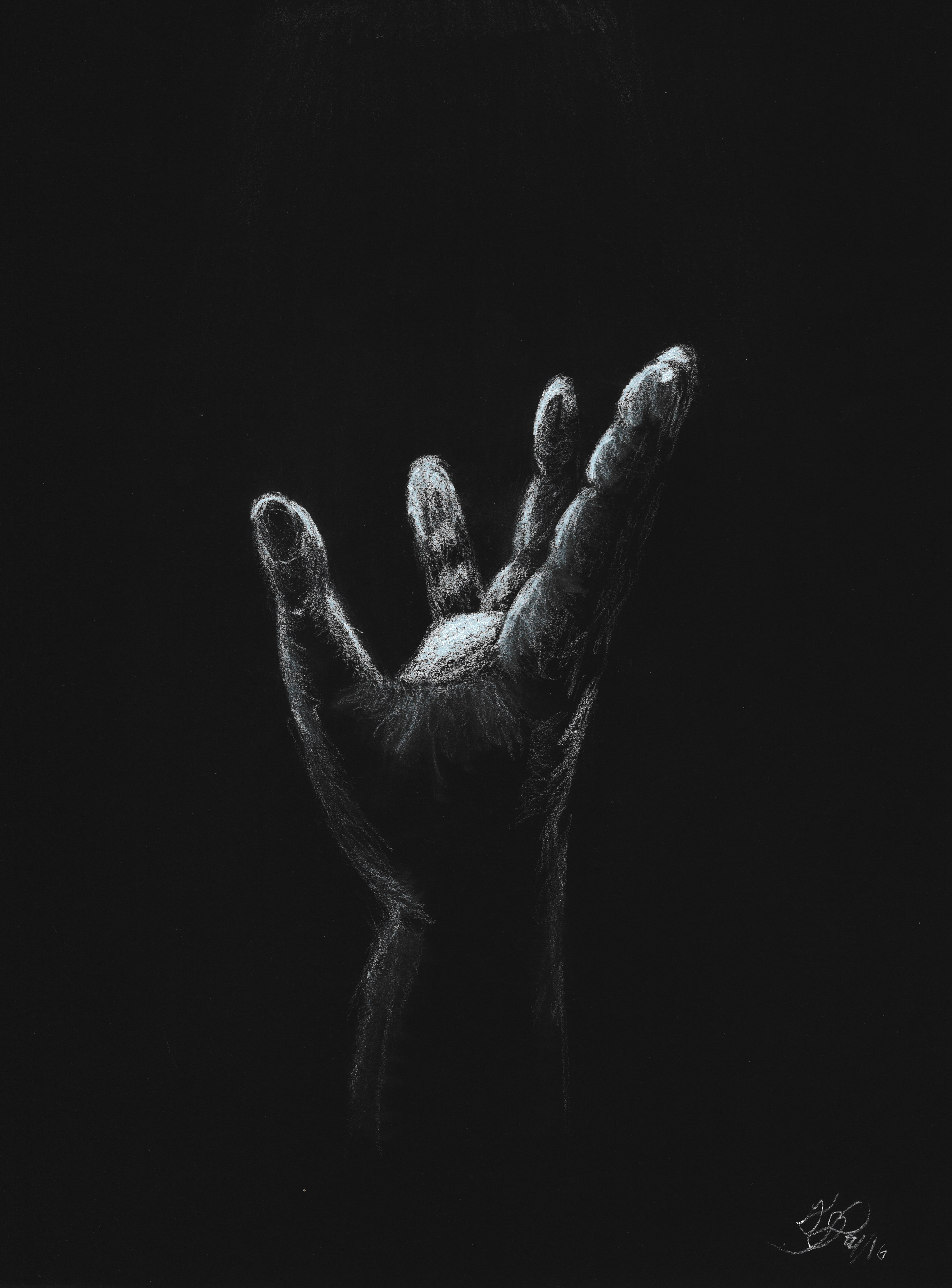
The Lenten Way of the Cross is an interactive audiovisual Stations of the Cross devotion. Each station has a song selection along with three curated reflection questions. Audiences are encouraged to listen to the piece while contemplating the image and the reflection questions.
For this project, I was tasked with creating a visual direction, logo, and set of images to visually convey each verse of Alan Hommerding's Scriptural Stations of the Cross. I chose to use the cohesive color palate of blues and blacks, reflecting the somber nature of the Passion Story. The artwork itself strips the scene through the use of silhouettes to only the most important elements, guiding the viewer to fill in the details through their own reflection.
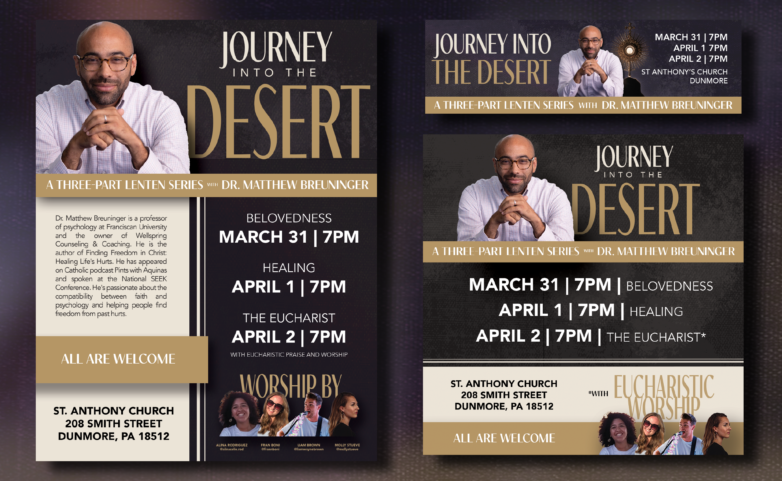
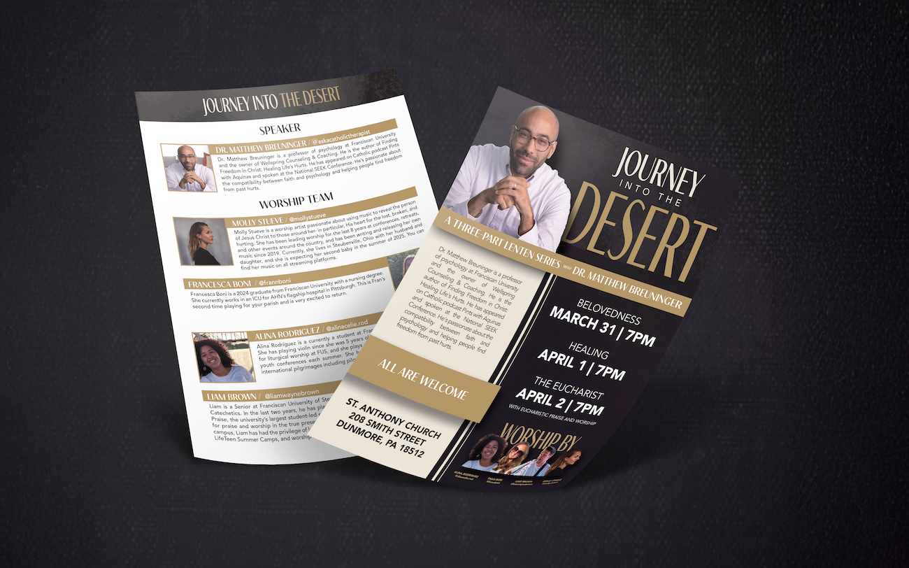
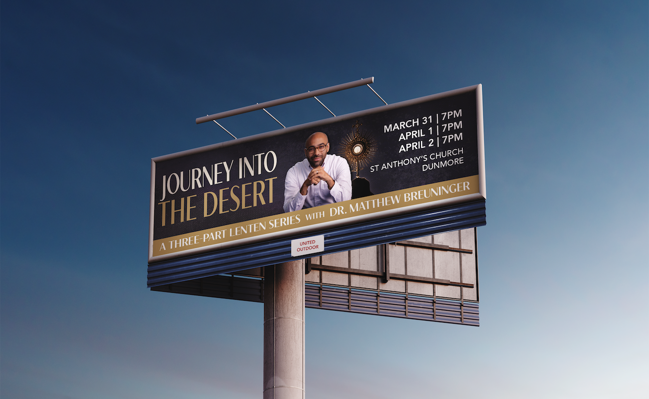
Journey Into The Desert is a three-night event featuring Dr. Matthew Breuninger that explores the intersection of psychology, sprituality, and healing.
As Director of Media for this event, I was tasked with creating visual branding that clearly communicated both the details and the tone, in multiple formats–including on a large-scale billboard. The tone of the branding was to meant to feel masculine and yet still present the event in a beautiful way. Typography was focused on heavily here to create visual coherence and informational hierarchy.
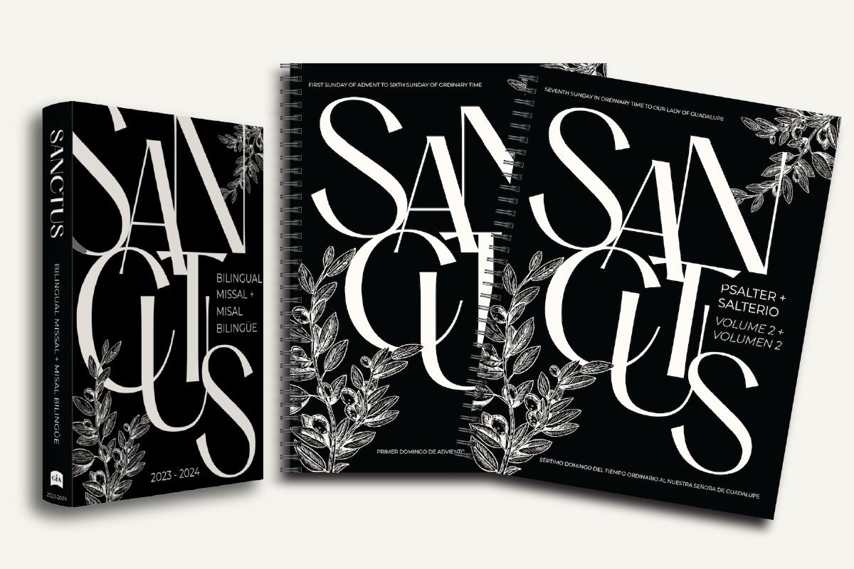
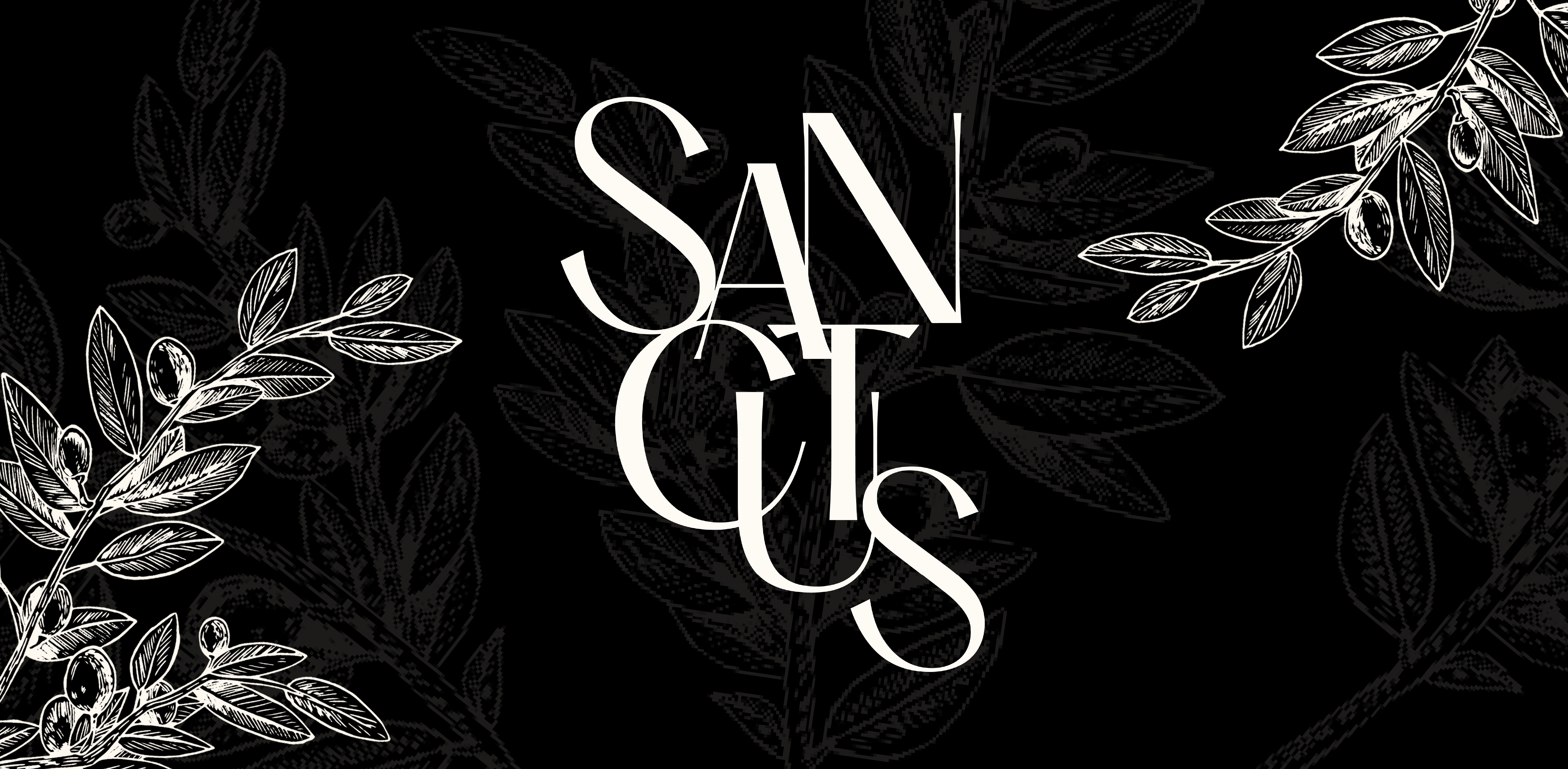
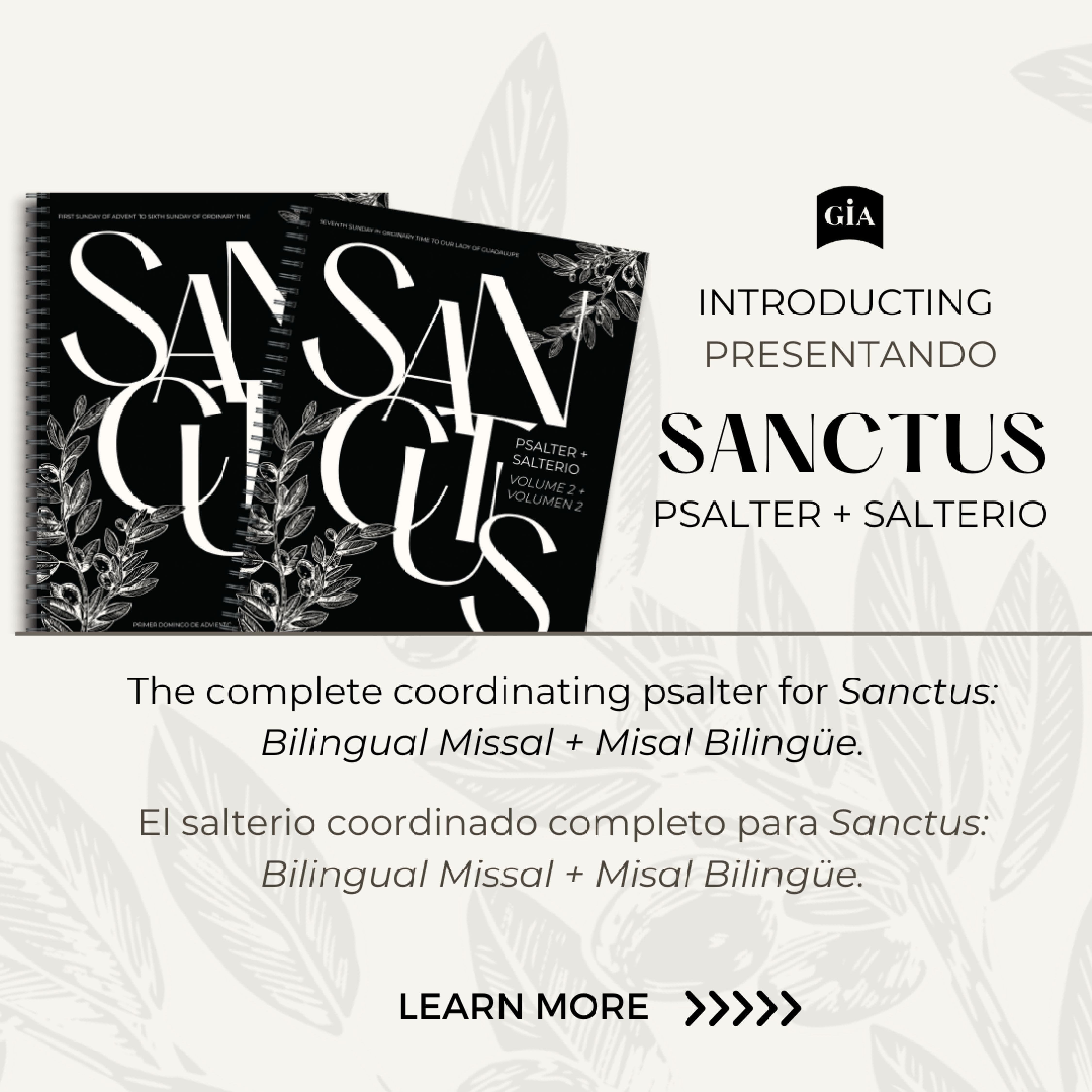
Sanctus: Bilingual Missal / Misal Bilingüe is a fully bilingual side-by-side liturgy resource that includes readings and psalm responses for Sundays and major feasts.
The intention for this missal cover was described to me as simple yet beautiful, visually conveying the meaning and translation of the title (holy). The olive branch, commonly linked with holy places, was chosen to communicate this idea. The branch also traditionally represents peace between nations – appropriate for a bilingual missal.
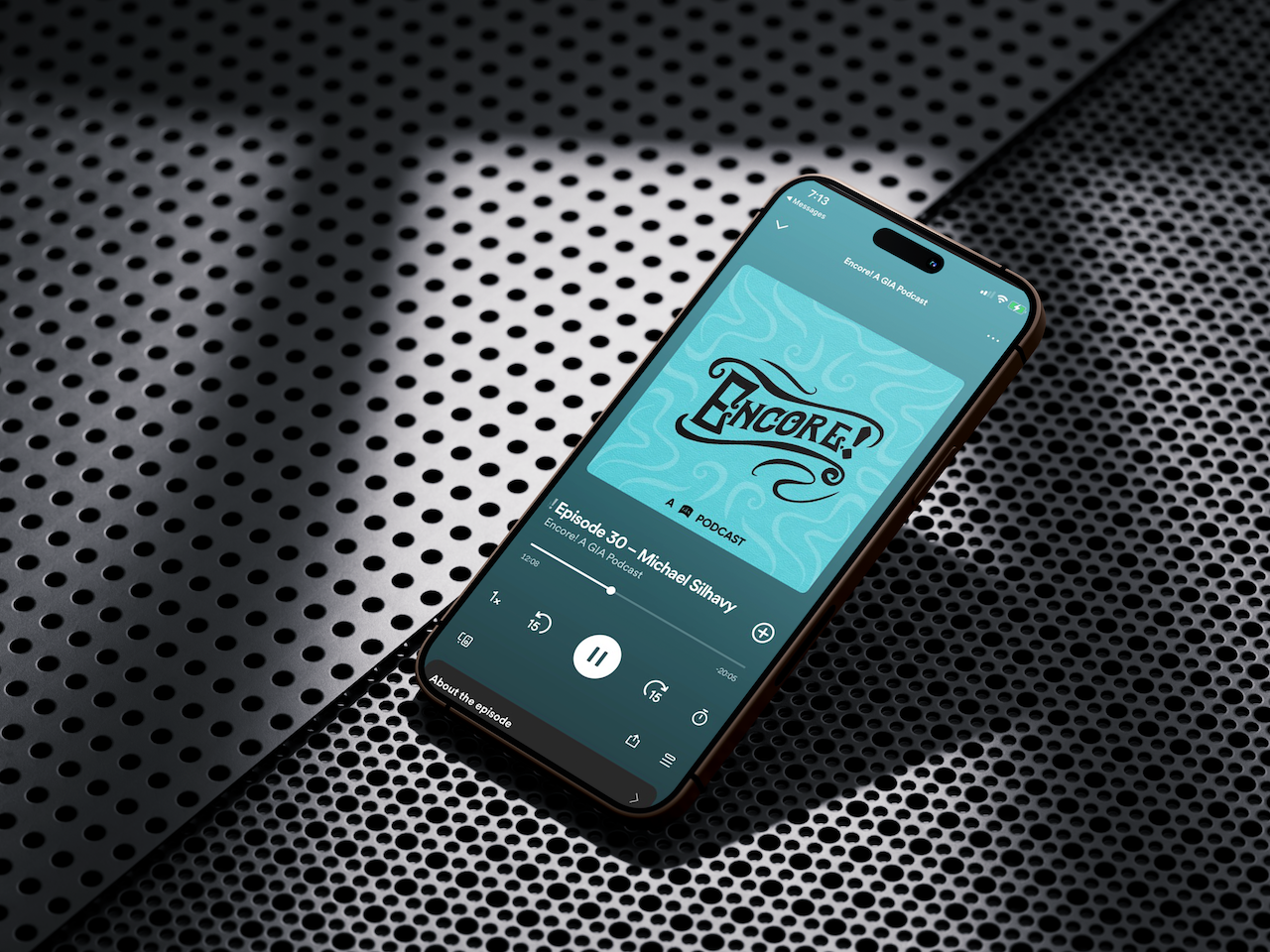
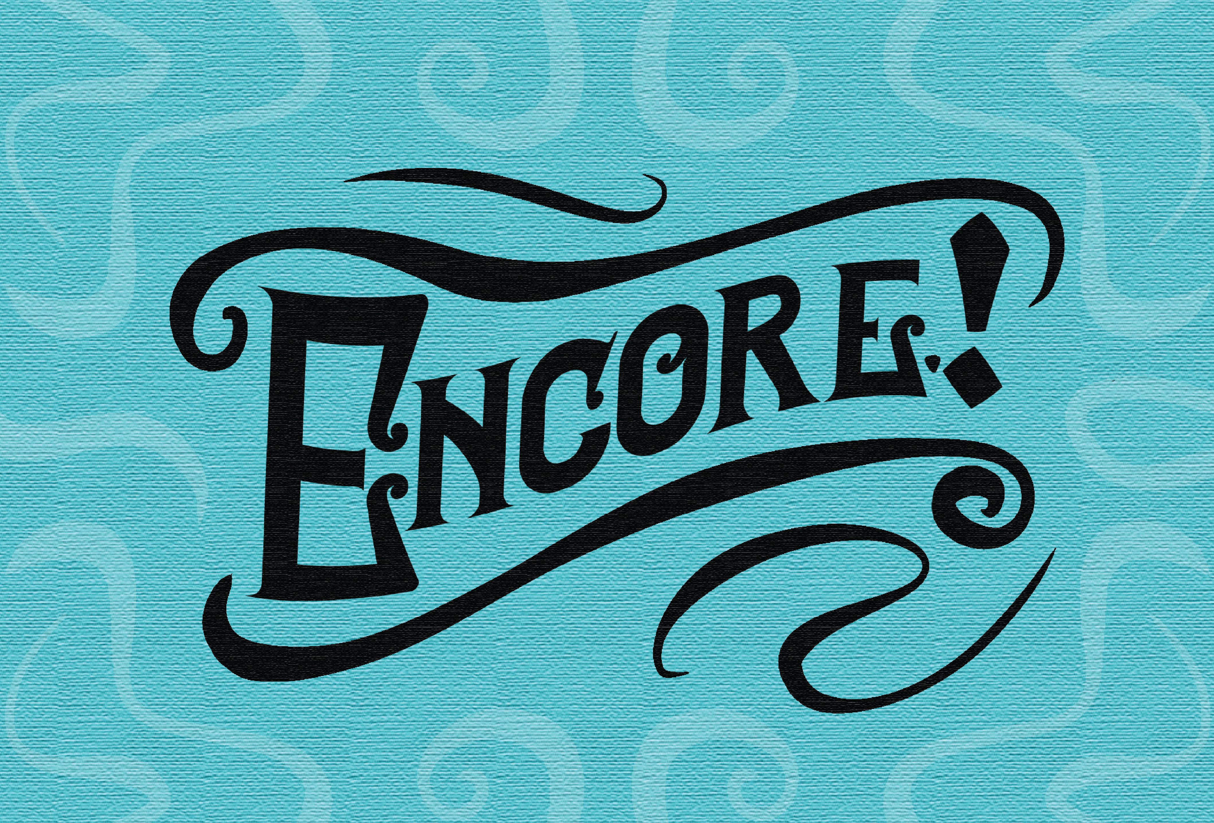
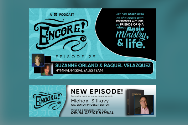
Encore is a GIA Podcast focusing on conversations about music, ministry, and life.
In creating the rebranding for this podcast, a script typography was customized to be reminiscent of old broadway styling. The decorative elements and textures were carefully created to convey dynamism.
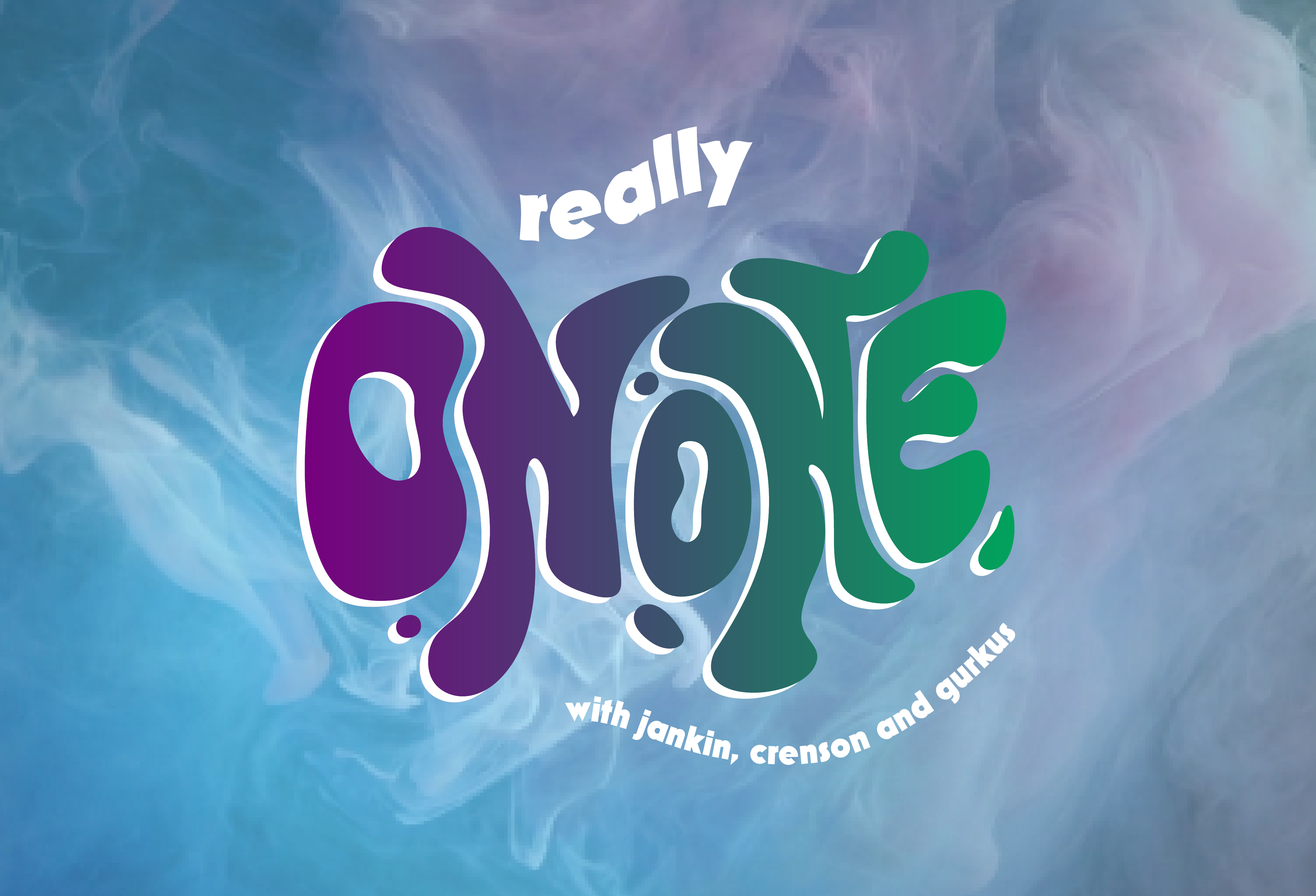
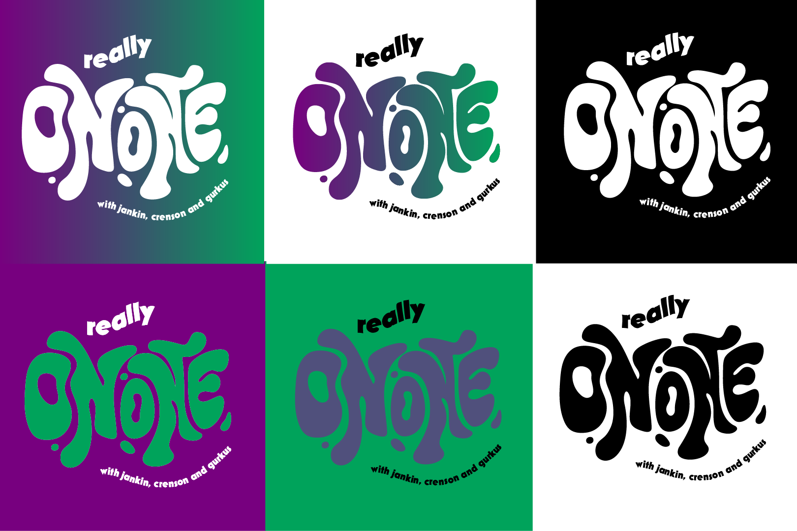
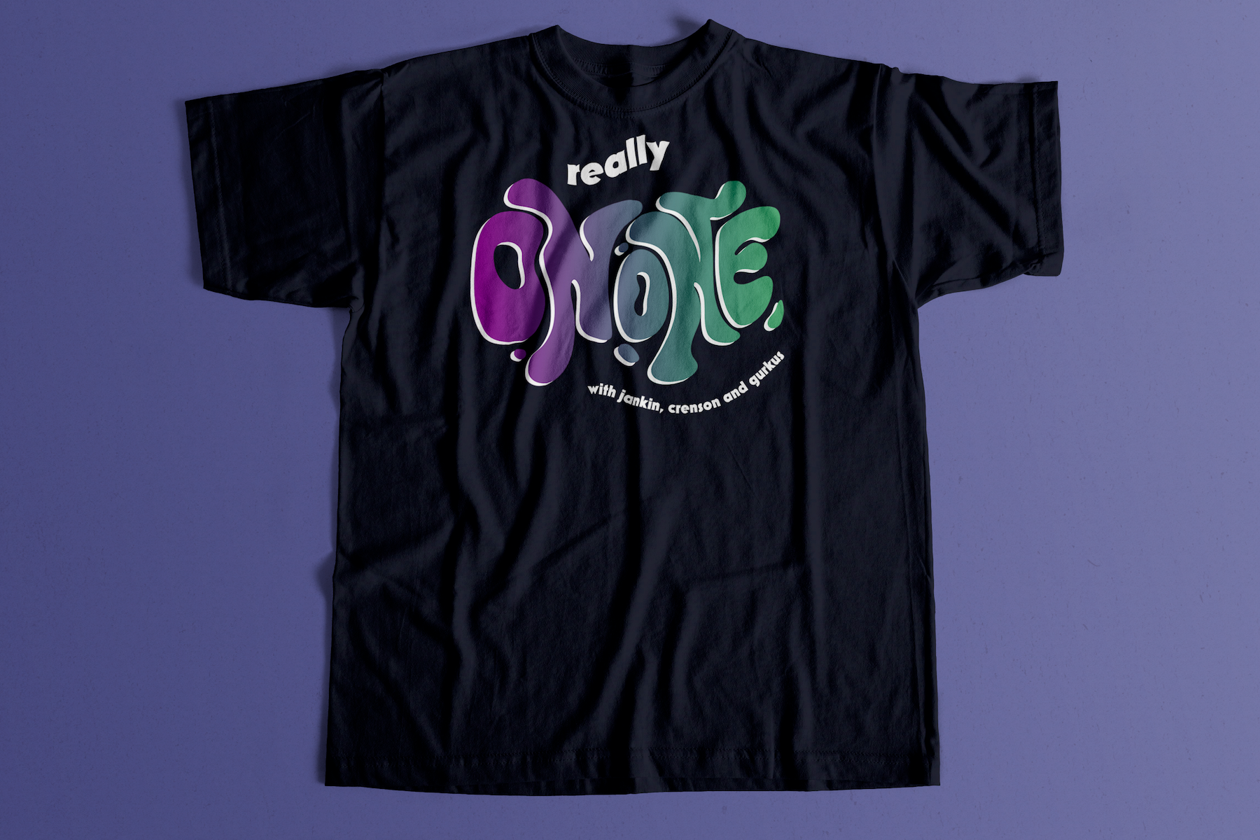
Really On One is a casual comedic podcast featuring a panel of three best friends.
In the creative direction process, I chose a bright, contrasting color palette to capture the fun, zany nature of the dynamic between the hosts. The typography was custom made and styled to be "out-there", further reflecting the tone of most of the episodes (and the name).